NFL Logos mixed with MLB Logos: The Good, Bad, & Ugly
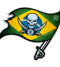
The losers over at @NFL_Memes ruined some NFL logos again; this time they had the nerve to combine them with MLB logos. While trying to maintain the team locations to determine which logos to mashup (and did pretty well with some), most are just completely awful.
The original images were posted at Brandon Hubschman’s Behance page & Daily Snark
Some of you may be aware of the negative history between @NFLRT & @NFL_Memes (and I’m not going to bore you with the details), so rather than sort them by NFL division, let’s have some fun and sort these logos out by the good, the bad, and the ugly.
Use page numbers to navigate to next page and see The Bad & The Ugly.
The Good
These NFL x MLB mashups are actually pretty appealing for fans of both teams involved from their respective cities.

Baltimore Ravens X Baltimore Orioles
The Ravens and Orioles made a pretty seamless transition here, although, the eye shouldn’t be red anymore.

Chicago Bears X Chicago Cubs
This logo works, especially because the Bears have been playing more like Cubs the past few seasons.

Houston Texans X Houston Astros
The Houston area has had a rough year in sports and these teams are like two peas in a pod.
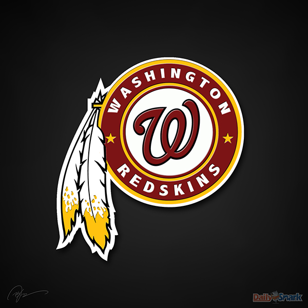
Washington Redskins X Washington Nationals
Nationals shouldn’t be offended by this logo.

San Diego Chargers X San Diego Padres
This Chargers x Padres logo really works with the lightning bolt forming the curve on the “D”.

Dallas Cowboys X Texas Rangers
While the white football shape is a little sloppy, the Rangers font fits the whole Cowboy theme pretty well.
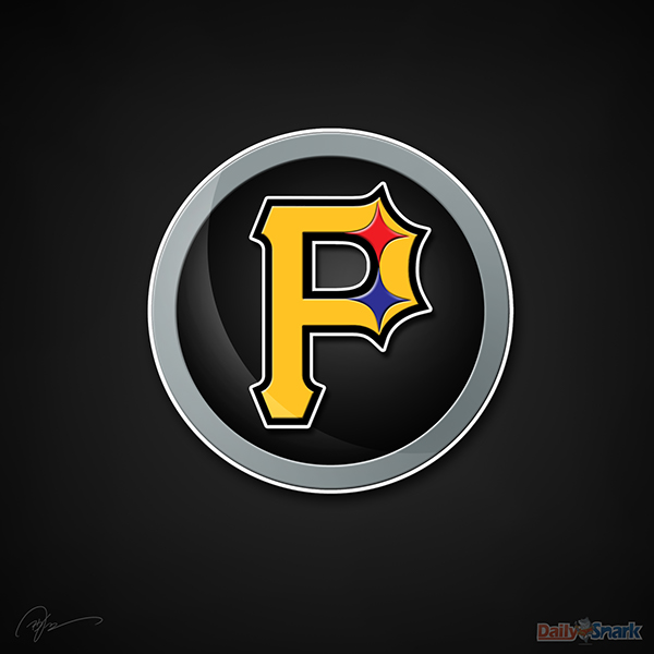
Pittsburgh Steelers X Pittsburgh Pirates
Pittsburgh makes it easy with all the major sports teams featuring black and yellow. The Steelers part just adds a little flair.

Oakland Raiders X Oakland Athletics
This is probably the most badass Elephant in sports and the Raiders should consider the change when they move to San Antonio or L.A.

Cincinnati Bengals X Cincinatti Bengals
This barely makes the good list because it’s not original. Bengals/Reds fans have been using a similar image for years.
Up Next: The Bad