- 2016 NFL Mock Draft
- NFL Marvel Helmets
- 2015 NFL Draft Results & Grades: 1st Round
- NBA Teams as NFL Helmets
- 2015 NFL Schedule Wallpapers
- Lynden Trail Interview and Player Breakdown: The most interesting man in the draft
- NFL Free Agency Winners/Losers
- 2015 NFL Mock Draft 2.0
- 2015 NFL Valentine’s Cards
- 2015 NFL Mock Draft by @codiki
NFL Logos mixed with MLB Logos: The Good, Bad, & Ugly
The Ugly
These are the really bad ones; the ones you hate to look at, but have to see. They should all be deleted and started from scratch.

Buffalo Bills X Toronto Blue Jays
This is a photoshop massacre that should’ve been scrapped from this batch.
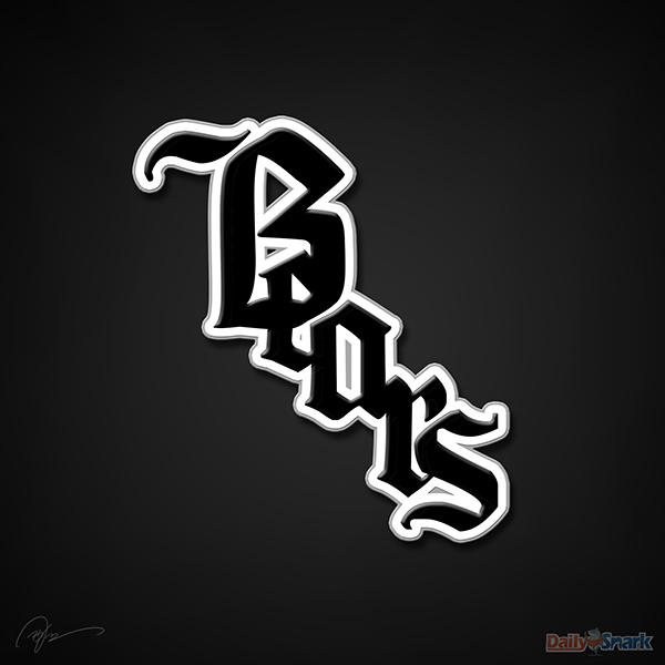
Chicago Bears X Chicago White Sox
Brors? Boars? Beors? This looks like a $20 tattoo on some fat guy riding a motorcycle with nothing but a wife beater on.
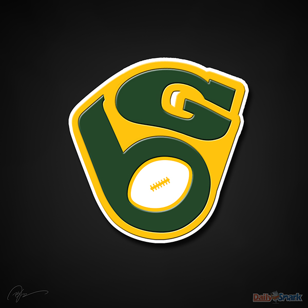
Green Bay Packers X Milwaukee Brewers
There’s a better version of this floating around on the internet. This version looks like stepped-in gum.
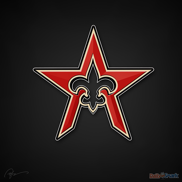
New Orleans Saints X Houston Astros
Lose the star because Saints fans don’t like that NFL team with the star. This should just be the Saints’ Fleurs-de-lis with an opened bottom, and that’s an easy one.

New England Patriots X Boston Red Sox
No those aren’t throwback Nike Elite socks, just socks that probably smell like a Sox fans’ breath.
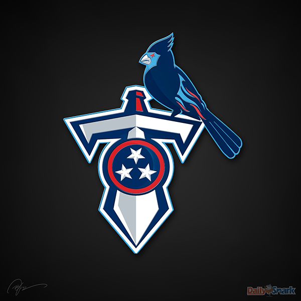
Tennessee Titans X St. Louis Cardinals
The poor Titans are always the forgotten team. This logo was so far down the priority list that birds have begun to perch on it.

Tampa Bay Buccaneers X Tampa Bay Rays
If pirates showed up to a battle at sea with these colors, they would’ve been laughed all the way back to shore.
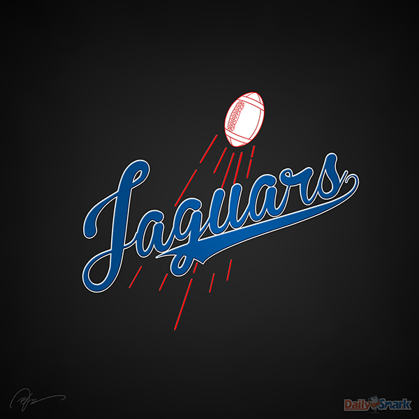
Jacksonville Jaguars X Los Angeles Dodgers
Most little league teams have logos better than this “Laguars” one.
Related Posts
-
 All 32 NFL Teams Redesigned Uniforms
@JesseAlkire has put his spin on all 32 NFL Teams’...
- January 1, 2015
-

-
 2014 NFL Mock Draft 2.0 (Post Free Agency Edition)
2014 NFL Draft: May 8th, 2014 Follow @DraftRT for more...
- March 21, 2014