- @SexyNFLFan of the Month
- Top-5 NFL MVP Candidates for 2014
- 2014 NFL Social Polls
- NFL Logos mixed with MLB Logos: The Good, Bad, & Ugly
- NFL Wives & Girlfriends
- The Ultimate Collection of Alternate NFL Logos
- NFL Doppelgängers
- All 32 NFL Team Uniforms Redesigned by Jesse Alkire
- Top 20 Plays from Week 2 (GIFs)
- 5 Reasons to Hate Roger Goodell
NFL Logos mixed with MLB Logos: The Good, Bad, & Ugly
The Bad
These logo mashups are on the verge of being good, but looks like the guys got lazy on them.
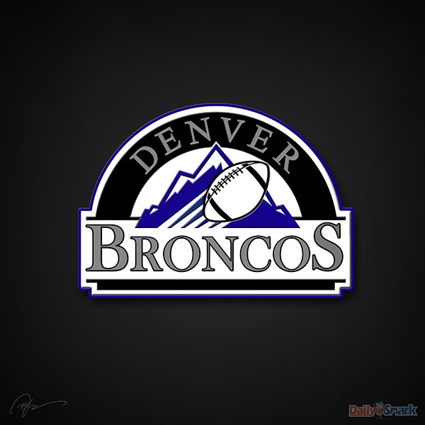
Denver Broncos X Colorado Rockies
This logo would get swept in the World Series.

Miami Dolphins X Miami Marlins
Copy. Paste. Zzzzzz….
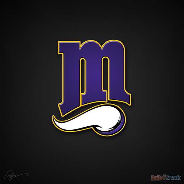
Minnesota Vikings X Minnesota Twins
The curve of the “M” and the curve of the Vikings horn don’t even match.

Arizona Cardinals X Arizona Diamondbacks
The color scheme looks good, but the wings inside the “A” looks like a lack of effort to incorporate the Cardinal.
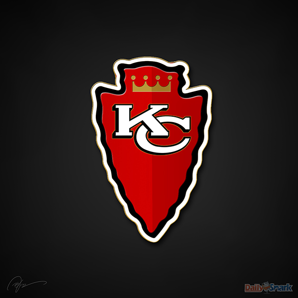
Kansas City Chiefs X Kansas City Royals
Members of Native American families and royal families alike are insulted by this logo.
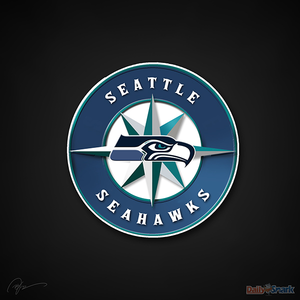
Seattle Seahawks X Seattle Mariners
They tried to be slick and incorporate the old Seahawks logo with a copy/paste, but it really just looks like they forgot the SB champs have a new logo/colors.
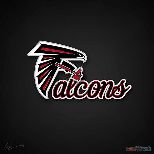
Atlanta Falcons X Atlanta Braves
Atlanta fans want the Falcon to throw the Braves tomahawk at whoever came up with this.
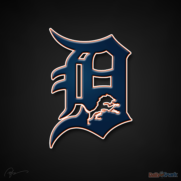
Detroit Lions X Detroit Tigers
This is a cheesy way to incorporate the Lions into the Tigers “D”. This logo has so much more potential than what is shown here.
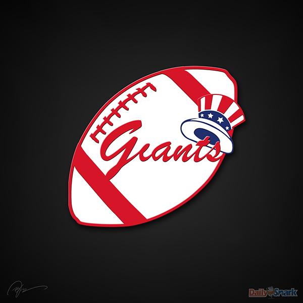
New York Giants X New York Yankees
The Yankees script is too well recognized and it looks silly in the Giants (Grants?) name.
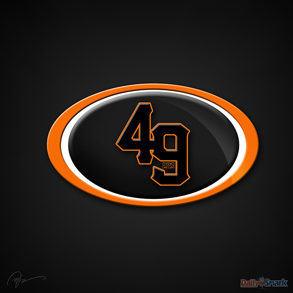
San Francisco 49ers X San Francisco Giants
Move the “ERS” to the outside of the 9 (which looks too much like a “g”, by the way).
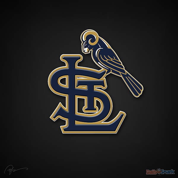
St. Louis Rams X St. Louis Cardinals
The Ram head actually looks tougher than the real Rams logo, but then they put it on a Cardinals body.

New York Jets X New York Mets
While it’s a pretty decent matchup, the teams make the bad list due to their performances of late.

Cleveland Browns X Cleveland Indians
The feather would’ve fit the Browns Elf logo better than it fits a dog. Annnnd Cleveland sports both suck.

Philadelphia Eagles X Philadelphia Phillies
Solid effort, but they overthought it when they typed “Eagles” in Script MT font. The Eagles worded logo would’ve fit better.
Logo image: http://bit.ly/1oldTpP
Up Next: The Ugly
Related Posts



-
 2014 NFL Mock Draft 2.0 (Post Free Agency Edition)
#5 Oakland Raiders - Louisville QB Teddy Bridgewater ...
- March 21, 2014
-
 NFL Teams Translated to World Cup Teams
USE PAGE NUMBERS TO NAVIGATE Group B Spain Redskins...
- June 25, 2014
-